 qptr.io
Test Your Roblox Thumbnail Before You Ship
You've made the art. It looks good in your editor, at full size, with nothing else on screen to compete with it. That tells you almost nothing about how it will actually perform, because no player will ever see it that way. Players see your thumbnail small, in a row, next to real competitors, on a homepage you don't control the layout of. Before you spend an upload slot finding that out the hard way, run it through a five-minute pre-publish workflow instead.
This isn't a design theory exercise — it's a case-study walkthrough of a concrete, repeatable process: upload, name, check across devices, filter to your genre, randomize placement, and isolate the card. Each step below takes under a minute and catches a different, specific failure mode. None of them require new art, and all of them are faster than shipping, waiting, and finding out from your play-through numbers instead.
Upload it
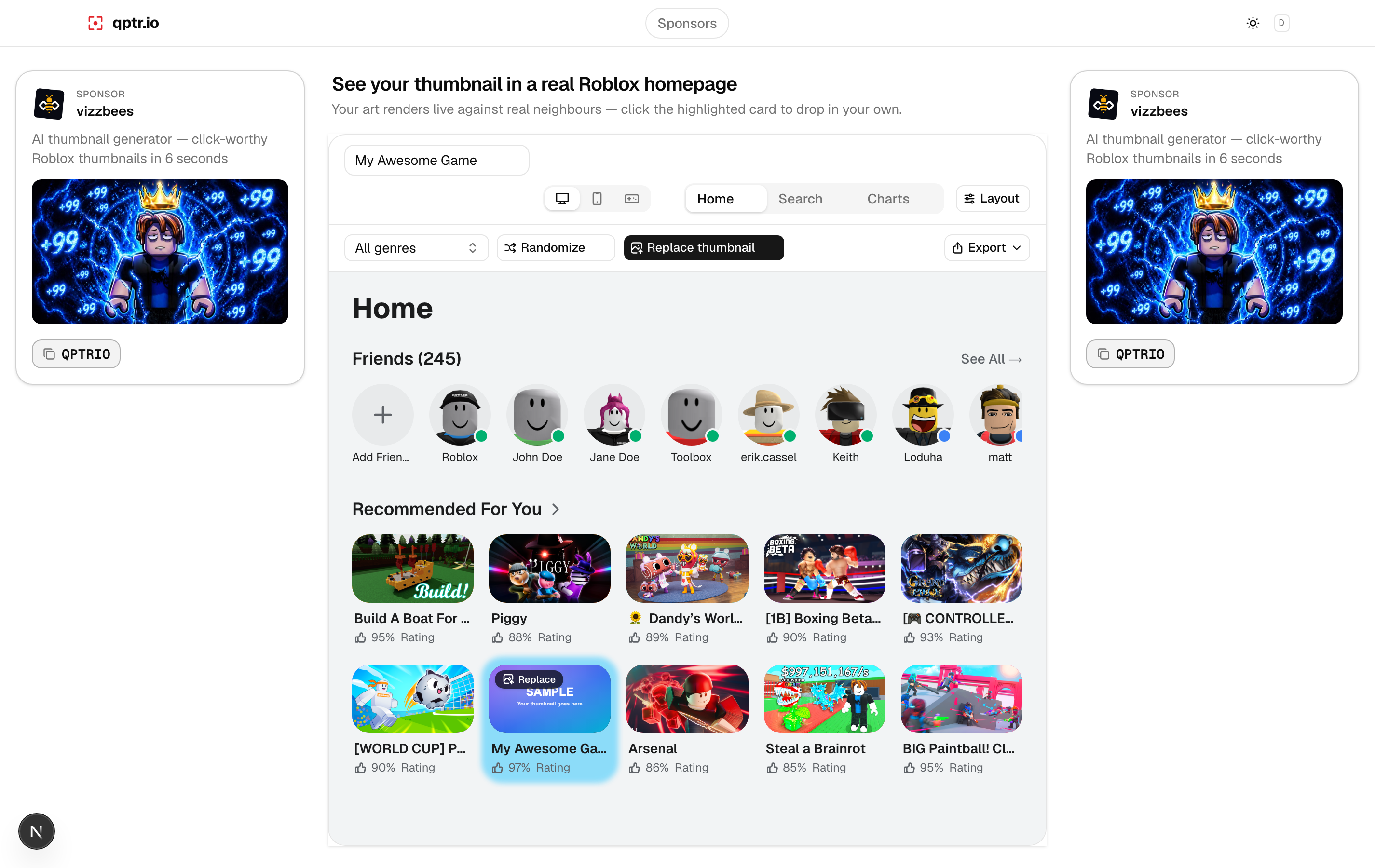
Start by dropping your thumbnail file into a simulated Roblox homepage — the same layout, chrome, and card sizing players will actually see. This is the step that turns "does this look good" into "does this look good here," which is the only question that actually matters. Uploaded images should stay local to your own testing; you're not publishing anything yet, just previewing.
Name it
Add your real experience name next to the art, not a placeholder. A title and a thumbnail are read together, in the same glance, and a strong image paired with a generic "My Game" label doesn't tell you anything useful about how the real pairing will read. If your title is long, check whether it crowds the card or forces an awkward wrap — that's something you want to catch now, not after launch.
Check desktop, mobile, and console
Roblox is played across wildly different screen sizes, and a card that reads clearly on a desktop monitor doesn't automatically read the same way on a phone screen or a console dashboard. Switch between layouts and look at the same thumbnail in each. It's common to find that a detail which was perfectly legible on desktop turns into a smear at mobile card size — better to catch that now than to have a chunk of your audience see a worse version of your pitch than you tested.
This step matters more than it sounds like it should, because Roblox's audience skews heavily toward mobile devices, where cards render smaller and the surrounding chrome eats up more of the available space. A thumbnail you only ever tested on a wide desktop monitor has effectively never been tested for most of the players who will actually see it.
Filter to your real genre
The row your thumbnail actually competes in matters more than any isolated judgment of the art. Filter the homepage to your genre so you're looking at your thumbnail next to the kind of experiences it will realistically be shown alongside, not a random assortment. This is the step that surfaces the uncomfortable question every developer should ask before shipping: does my thumbnail look like it belongs in this genre, or does it disappear into a row of near-identical competitors?
Randomize placements
Don't just check the one position you assume your card will land in. Randomize where your thumbnail sits in the row — first, middle, buried a few cards deep — because a homepage doesn't hand you a fixed, favorable slot. A thumbnail that only reads well in the leftmost position isn't solving the actual problem, which is standing out no matter where the algorithm happens to place it.
It's a quick check, but it changes what you notice. Designers naturally imagine their own thumbnail in the best possible spot — clear space around it, nothing crowding it. Randomizing removes that bias and shows you the version of the row a player is actually likely to scroll past, which is the only version that determines whether they click.
Toggle the highlight
Turning on a highlight or focus view of just your card, separate from the row around it, is useful for one specific question: with everything else removed, does the subject still read instantly? If you have to squint or think even with no competing cards around it, that's a composition problem no amount of favorable placement will fix — solve it before you worry about anything else on this list.
What to actually look for
Running through the workflow above is only useful if you know what you're checking for at each step. Three questions cover almost every real failure mode:
- Does the subject read instantly? If you can't identify what the thumbnail is about within a glance, neither can a player scrolling past it at normal speed.
- Does the title survive? Check that your game's name doesn't overlap key art, get crowded by a long line wrap, or lose contrast against whatever's behind it.
- Does it melt into the row? Sitting among real neighbours in your genre, does your card visually separate itself, or does it blend into the same palette and composition as everything around it?
If the honest answer to any of those is "no" or "not sure," that's the part worth fixing before you ship — not after you've already spent an upload slot and started collecting data on the wrong art.
Preview your thumbnail free →For the design principles behind what makes a thumbnail worth testing in the first place, see what makes a great Roblox thumbnail.