 qptr.io
How to Make a Roblox Thumbnail (Step by Step)
A great Roblox thumbnail isn't judged on a big screen at 100% zoom — it's judged in a ~200px-wide card, next to a dozen competitors, in the half second before someone decides whether to click. Every step below is built around that constraint. Here's the full workflow, from blank canvas to a published, tested thumbnail.
Start from the card, not the canvas
Before you open an art tool, decide what has to read at ~200px wide: one subject, one expression, one idea. It's tempting to start designing at full size and worry about legibility later, but that order produces thumbnails that look great in your editor and disappear on the homepage. Sketch the composition small first — even a rough thumbnail-sized mockup — and only then build it at full resolution.
This ordering matters because most of the decisions that make a thumbnail work or fail are made in the first five minutes, before a single pixel is painted: what's the subject, where does it sit in the frame, what's the one feeling it needs to sell. Fixing a weak concept with better rendering later rarely works — a busy, unclear composition still reads as busy and unclear no matter how much polish goes into the linework or lighting. Get the concept right small, then spend your production time making that concept look good, not discovering a new one halfway through.
Set up the canvas
Roblox thumbnails are 16:9, and the correct upload size is 1920×1080 pixels. Set your canvas to that exact ratio from the start rather than cropping down later — cropping after the fact is how off-center compositions and clipped subjects happen. See the Roblox thumbnail size guide for the full spec, file-size limits, and supported formats.
While you're setting up the canvas, do the same for your icon if you haven't already — a square, separate composition, not a crop of the thumbnail. Handling both up front means you're never tempted to reuse one piece of art for both slots later, which is one of the more common last-minute mistakes before publishing. See the Roblox game icon size guide for that spec.
Compose: one subject, one emotion
Pick a single focal point — a character's face, a dramatic pose, a key object — and build the whole frame around it. A strong emotion (shock, excitement, tension) reads faster than a neutral one, even at small size. Use the rule of thirds to place that subject off-center rather than dead center, and keep the background doing supporting work: a blurred set, a color wash, a simple gradient. If the background competes with the subject for attention, simplify it until it stops.
Resist the urge to show everything your experience offers in one frame. A thumbnail with three characters, a vehicle, a boss, and a UI overlay all crammed in reads as noise at card size — a viewer's eye has nowhere to land, so it lands nowhere and moves on. One subject, rendered clearly and large in the frame, consistently beats a busy composite. If your experience has several sellable moments, that's an argument for several thumbnail candidates, not for cramming them into a single one — more on that in the personalization section below.
Color and contrast against the Roblox UI
Your thumbnail doesn't sit on a neutral canvas — it sits inside Roblox's
own interface, which is white in light mode and a near-black
#16181d-ish in dark mode. Art that's mostly mid-tone gray, or that
leans heavily toward pure white or near-black itself, tends to melt into
whichever theme surrounds it. Push your subject's contrast up and make
sure its edges are still distinct from both a white card background and
a dark one.
This is easy to miss because most art tools default to a neutral gray or checkered canvas background, which hides the problem until the thumbnail is actually placed next to real UI. A card that looks perfectly readable floating on a gray canvas can disappear the moment it's dropped onto a pure white homepage, or blend into a dark-mode sidebar. Check both themes before you call a composition finished — plenty of players browse Roblox in dark mode, and a thumbnail that only works in one theme is only doing half its job.
Text: three words max
If you add text, keep it to three words or fewer — anything longer becomes an unreadable smear at card size. And never place it in the bottom strip of the frame: that's the zone Roblox's player-count overlay sits on top of, so text there gets covered before anyone can read it. See the safe-zones section of the thumbnail size guide for exactly where that overlay lands.
Text works best as a punctuation mark, not a headline — a single word like "NEW", "UPDATE", or a version tag, set large and high-contrast, rather than a sentence describing the experience. If your concept needs a sentence of text to land, the image itself isn't carrying enough of the pitch, and that's worth fixing in the composition before reaching for a bigger text box.
Export
Export as PNG or JPG, and keep the file under 3MB. Double-check the final export is still 1920×1080 at 16:9 — some tools quietly add padding or resize on export, which reintroduces the exact aspect-ratio problem you avoided by setting up the canvas correctly in the first place. Open the exported file itself, not just the canvas in your editor, and confirm the dimensions and file size before you upload — a wrong export setting is an easy way to lose an upload slot to a rejected or distorted file.
Test it on the homepage before you publish
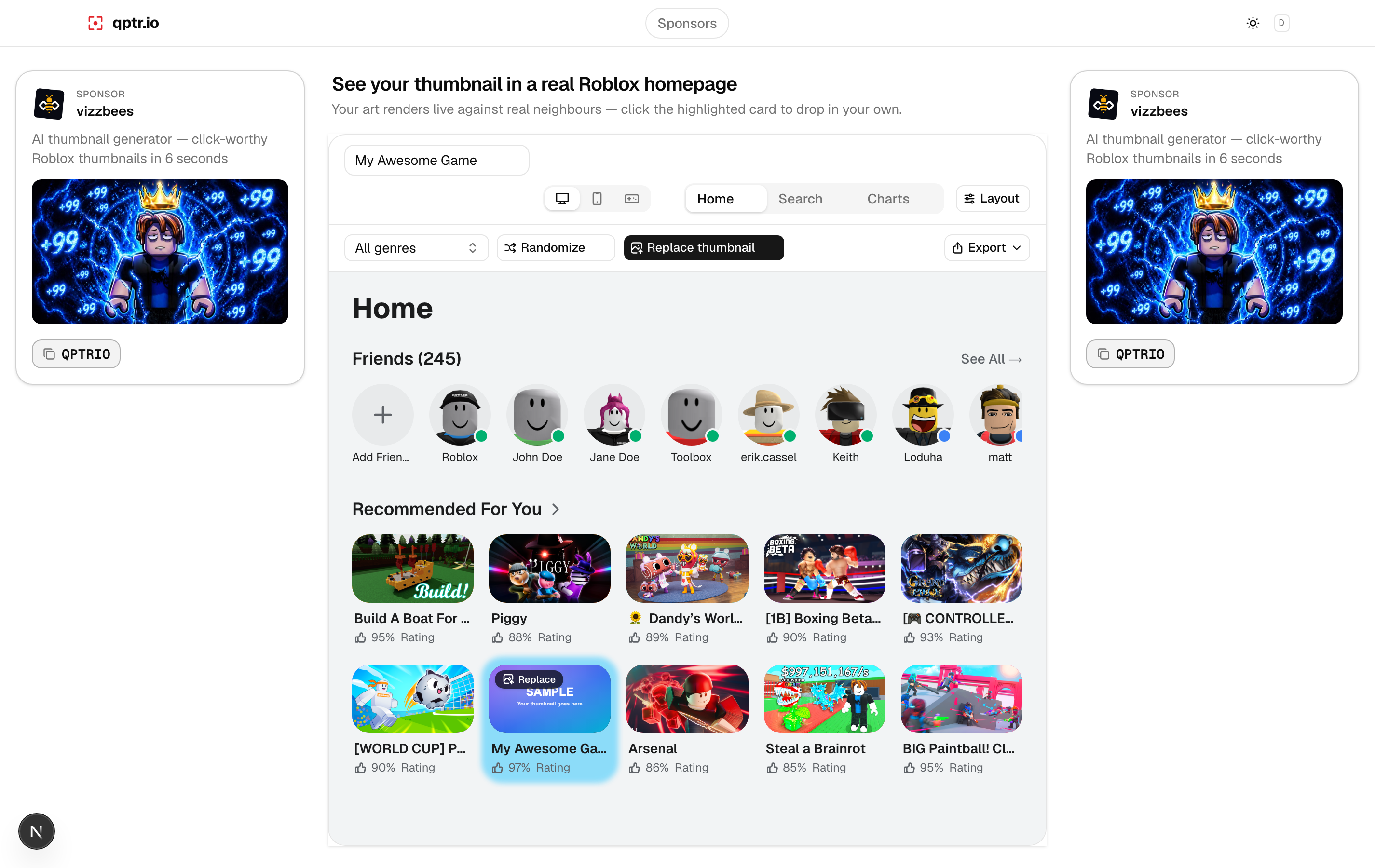
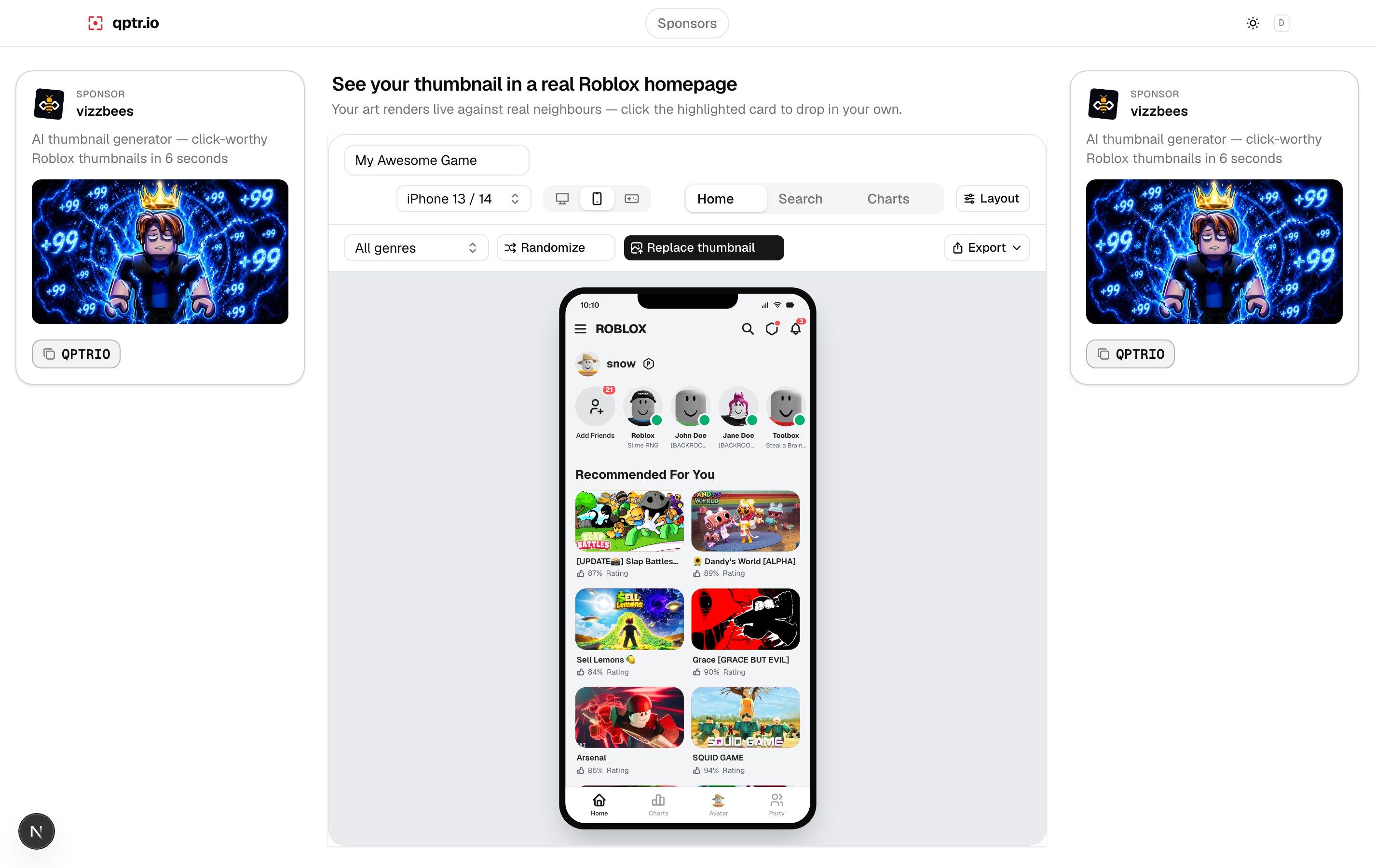
The last step is the one most people skip: seeing your thumbnail exactly where players will, before you spend an upload slot finding out it doesn't work. Here's the same thumbnail previewed on both a desktop homepage and a mobile home screen:
Iterate with personalization
Roblox's thumbnail personalization system runs multiple active thumbnails per experience and shows different ones to different players, favoring whichever performs best over time — Roblox's own testing found this averaged a +8.5% lift in qualified play-through rate. Don't stop at one thumbnail: upload 2 to 5 candidates with genuinely different compositions, focal subjects, or color treatments, and leave them active rather than picking a single "winner" early. For ideas on what those candidates could look like, see Roblox thumbnail ideas by genre.
It's worth repeating why this matters: the lift compounds as the personalization model learns which thumbnail wins with which player segment, and that learning needs live variation to work with. A single "safe" thumbnail, however well made, is a ceiling on what personalization can do for your experience — a real set of candidates is what turns this step from a one-time task into an ongoing advantage over experiences that shipped one thumbnail and stopped there.