 qptr.io
Roblox Thumbnail Ideas That Actually Work
Staring at a blank canvas is the hardest part of making a thumbnail. The concepts below aren't arbitrary — each one is built around what still reads clearly once it's shrunk to a ~200px homepage card, and each one maps to genres where it consistently outperforms. Use them as a starting point rather than a template to copy exactly — the goal is to borrow the underlying reason a concept works and apply it to your own subject, not to reproduce someone else's composition.
Here's what's actually running on the homepage right now:
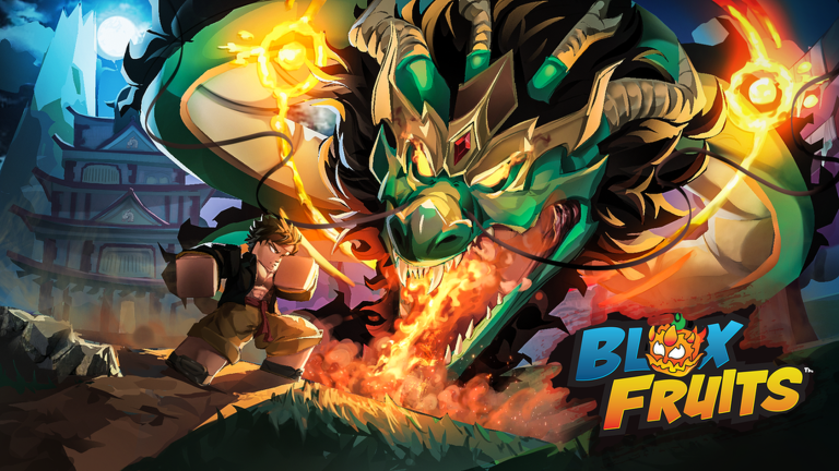
219.0K playing · 84% rating
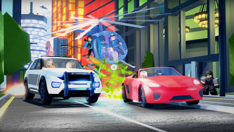
8.9K playing · 84% rating
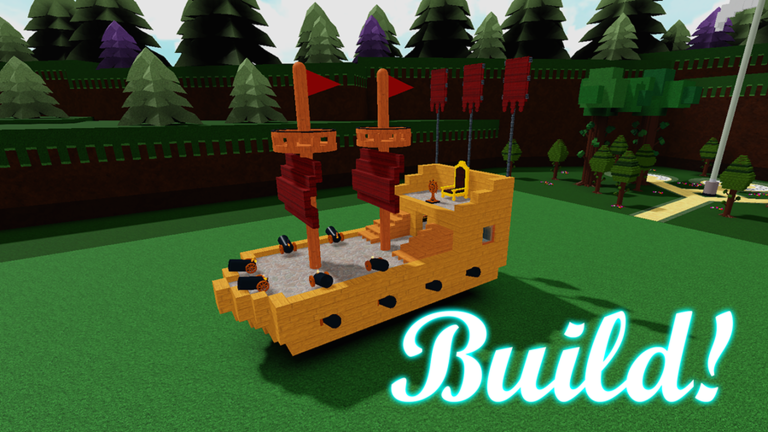
14.3K playing · 95% rating
![[🐝] 99 Nights in the Forest 🔦 — Roblox game thumbnail](https://tr.rbxcdn.com/180DAY-982ec75ffeb376d3e08abecf81c5811d/768/432/Image/Png/noFilter)
158.0K playing · 95% rating
![Fisch 🐟 [HARPOON GUNS] — Roblox game thumbnail](https://tr.rbxcdn.com/180DAY-17ce753c4b1f087c5eda362c24457e25/768/432/Image/Png/noFilter)
41.8K playing · 87% rating
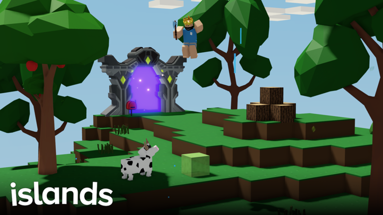
1.0K playing · 92% rating
Notice what these have in common even across very different genres: a single clear subject, high contrast against the background, and almost no reliance on text to make the pitch. That pattern shows up again and again in the concepts below.
Character close-up with strong emotion
A single face, cropped tight, mid-expression — shock, joy, fear, triumph — reads instantly at card size because there's nothing else competing for attention. This works almost everywhere, but it's especially strong for roleplay and story-driven experiences where the emotional hook matters more than showing off mechanics or environment. The expression should be unambiguous even with the rest of the face out of frame — if you have to study it to tell what the character is feeling, it won't land any faster for a player scrolling past at speed.
Before/after or transformation shots
Splitting the frame to show a weak state next to a powered-up one — small character next to giant, empty inventory next to full — communicates progression in a single glance. This is the dominant thumbnail style in simulation experiences, where the entire appeal of the genre is getting bigger, stronger, or richer, and the thumbnail's job is to promise that arc before anyone presses play. The split doesn't need to be literal — a side-by-side is the clearest version, but even a single frame that implies scale (a tiny starting character dwarfed by what they'll become) carries the same promise.
Threat-over-the-shoulder
Framing the shot from behind or beside the player character, facing something dangerous — a monster, a rival, a collapsing structure — sells tension without needing any text. It works because it puts the viewer in the player's position rather than showing a detached scene, which is exactly the feeling survival experiences are selling. Keep the threat clearly readable, not obscured in shadow for atmosphere — a silhouette that's too dark to identify at card size loses the tension it's meant to create rather than heightening it.
Squad shot
A lineup of several characters together, usually posed rather than mid- action, signals "bring your friends" at a glance. This is the strongest default for party and roleplay experiences, where the social angle — who you're playing with — matters as much as what you're doing. Vary each character's pose and silhouette slightly rather than lining them up identically — a row of near-identical poses reads as one blurred shape at small size, while distinct silhouettes read as "a group" even in a half-second glance.
Item or vehicle hero shot
Putting the object itself front and center — a weapon, a car, a plane — works when the item is the appeal, not a character. Shooter and fighting games lean on this because a recognizable, well-lit hero shot of the equipment communicates the whole pitch instantly, without needing a character or a scene to carry it. Light the object from an angle that shows its shape rather than flattening it — a hero shot lit flat from the front loses the depth cues that make it look substantial, even though those same cues barely register consciously at full size.
Picking a concept for your experience
If more than one of these fits, that's normal — most experiences could honestly run two or three of these concepts as separate candidates rather than trying to pick the single "correct" one up front. Start with whichever concept matches the single strongest thing your experience already has going for it: a distinctive character, a satisfying progression loop, a genuinely tense moment, a strong social scene, or a hero item. Build your first thumbnail around that, then use the others as your next candidates when you get to testing — see how to make a Roblox thumbnail for the full workflow from concept to a published, tested thumbnail.
It's tempting to treat "which concept is best" as a question with one right answer, but Roblox's own thumbnail personalization system is built on the opposite assumption: different players respond to different pitches, so the winning move is usually to run several of these concepts at once rather than betting everything on a single composition. A character close-up might out-click a hero shot with one audience segment and lose to it with another — you find that out by having both live, not by guessing in advance.
Explore full galleries for shooter, fighting, simulation, survival, roleplay, and party thumbnails.
Preview your thumbnail free →