 qptr.io
What Makes a Great Roblox Thumbnail?
Every experience on the Roblox platform lives or dies on a strip of pixels roughly 200px wide. Before a player reads your description, watches a trailer, or sees a single line of code you wrote, they see your thumbnail — for a fraction of a second, next to a dozen competing cards. That glance is the entire pitch. Get it right and players click in. Get it wrong and they scroll past, and nothing else about your experience gets a chance to matter.
This isn't a spec sheet. If you need the exact dimensions, formats, and file-size limits, see the Roblox thumbnail size guide. This is the harder part: what actually makes players stop scrolling and tap — the design decisions no spec sheet can hand you, because they depend on your specific characters, world, and tone.
Your thumbnail is your ad
Treat your thumbnail like paid ad creative, because functionally that's what it is. It's the one asset standing between an impression and a qualified play-through, and Roblox's own data backs that up directly. Roblox's thumbnail personalization system runs 2 to 5 active thumbnails per experience and automatically shows different ones to different players, then favors whichever performs best. In Roblox's testing, this produced an average +8.5% lift in qualified play-through rate, with some individual experiences seeing gains as high as +50%.
Read that number again: the same experience, the same gameplay, the same description — just a different thumbnail — and some developers saw play-through rates jump by half. Roblox wouldn't build and run a whole personalization system around thumbnails if the image itself only mattered a little. It exists because the thumbnail moves the number more than almost anything else you control at the top of the funnel. Design it with that seriousness, and prepare more than one candidate — a single "safe" thumbnail can't benefit from personalization at all.
That also reframes how you should think about "finishing" a thumbnail. There's no single correct answer to design toward, because the system is built to compare answers against each other and keep learning. A developer who ships one thumbnail and calls it done is opting out of the exact mechanism that produced those double-digit gains — not because their art is bad, but because there's nothing for the system to compare it against.
One clear subject
The single most common failure in a weak thumbnail is having no clear subject. A player's eye needs somewhere to land in the first instant, and if your composition asks them to figure out what they're looking at, you've already lost the click — nobody stops scrolling to decode an image.
Pick one hero: a character, a vehicle, a striking environment moment. Make it large, make it centered or rule-of-thirds placed, and make everything else in the frame exist to support it rather than compete with it. If you can't describe your thumbnail's subject in three words, it doesn't have one yet. Busy battle scenes, crowded lobbies, and wide establishing shots all read as noise at card size — save those for your gallery or trailer, not your primary thumbnail.
Emotion sells the click
Faces work because players are wired to look at them, and an expressive face does something a logo or a landscape can't: it tells the player how they're supposed to feel in half a second. Shock, triumph, fear, joy — whatever emotion matches your experience, a clear expression communicates it instantly, before a player has read a single word of your title.
This is why so many of the strongest thumbnails on Roblox put a character front and center with an exaggerated, readable expression, rather than a neutral pose or a distant shot. If your experience has any character at all — human, creature, mascot — an emotional close-up is very often a stronger thumbnail than a wider action shot, because it sells a feeling instead of just showing a scene.
Color against the feed
Your thumbnail isn't judged in isolation — it's judged sitting in a row of neighboring cards, on both a light and a dark version of Roblox's UI. A thumbnail that looks great full-screen in your editor can disappear completely once it's shrunk down and surrounded by ten other cards fighting for the same attention.
Bold, saturated color that contrasts with the background UI travels much further than a muted, "cinematic" palette. Think about what's around your card: other thumbnails, Roblox's own chrome, the player-count overlay. Your subject should pop against all of it, not blend into a similar tone. A strong technique is picking one dominant color and letting it carry the whole frame, rather than splitting attention across many competing hues — consistency reads as intentional, and intentional reads as quality.
What top games get right
Look at any row of high-performing experiences on the Roblox homepage and a few patterns repeat constantly:
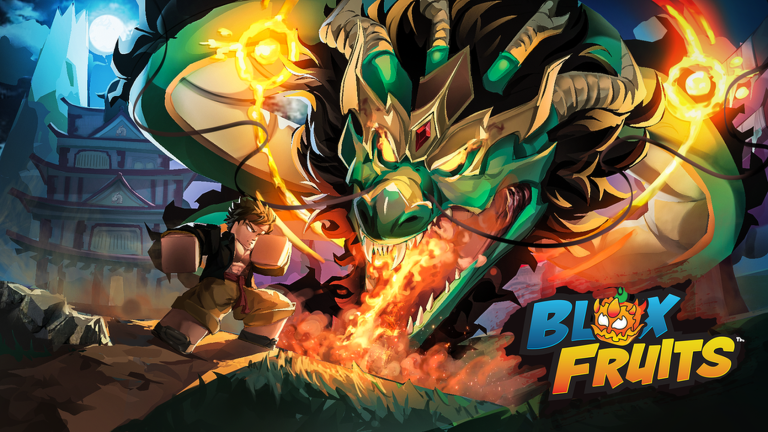
219.0K playing · 84% rating
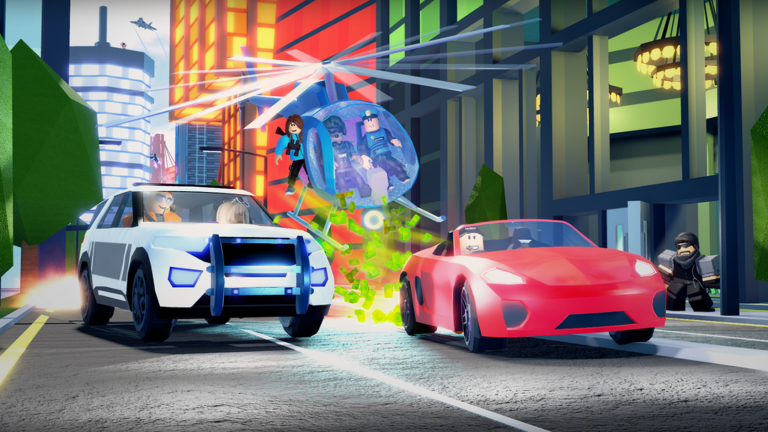
8.9K playing · 84% rating
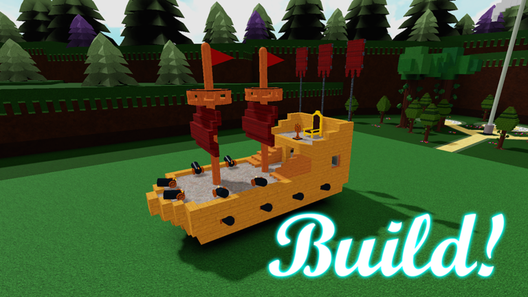
14.3K playing · 95% rating
![[🐝] 99 Nights in the Forest 🔦 — Roblox game thumbnail](https://tr.rbxcdn.com/180DAY-982ec75ffeb376d3e08abecf81c5811d/768/432/Image/Png/noFilter)
158.0K playing · 95% rating
![Fisch 🐟 [HARPOON GUNS] — Roblox game thumbnail](https://tr.rbxcdn.com/180DAY-17ce753c4b1f087c5eda362c24457e25/768/432/Image/Png/noFilter)
41.8K playing · 87% rating
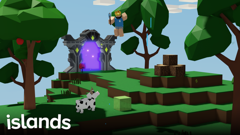
1.0K playing · 92% rating
Three things stand out across almost every strong thumbnail above. First, one subject fills most of the frame — there's no ambiguity about what you're looking at within the first glance. Second, the color is loud and saturated, often built around a single dominant hue rather than a naturalistic, muted palette. Third, the composition survives being shrunk — nothing essential sits in a thin border or a busy corner where it would vanish at card size.
None of this requires expensive art. It requires discipline: pick one subject, commit to bold color, and ruthlessly cut anything that doesn't serve the read at a glance. Scroll through enough of these and a pattern emerges — the strongest thumbnails could be described accurately by someone who only saw them for half a second, which is exactly the constraint you're designing for.
The mistakes that kill CTR
Most weak thumbnails fail for the same handful of reasons, over and over:
- Clutter. Multiple characters, background detail, UI screenshots crammed into one frame — the eye has nowhere to land, so it moves on.
- Tiny text. Any text small enough to require zooming in is invisible at the ~200px width a homepage card actually renders at. If a word can't be read at a glance, it isn't doing anything for you.
- Text in the bottom strip. The bottom band of every card carries a player-count overlay. Anything you place there — a logo, a title treatment, a key detail — gets covered. Keep essential content in the centered safe zone instead.
- Misleading art. A thumbnail that promises a different game than the one you're shipping earns the click once and loses the player immediately after — and it drags down the very play-through metric personalization is trying to optimize.
Each of these is fixable in an afternoon, and fixing them is usually higher-leverage than any other change you can make to your store page. None require new art assets or a redesign — most are composition and cropping fixes on art you've already made, which is exactly why they're worth checking before you ship anything more expensive.
Judge it at card size, not canvas size
The gap between "looks good in my design tool at 100% zoom" and "reads clearly as a small card in a crowded feed" is where most thumbnails quietly fail. It's easy to design something that looks polished up close and completely falls apart once it's shrunk down next to real competitors — and by the time you find out, you've already spent an upload slot.
Before you publish, preview your thumbnail exactly the way a player will encounter it: small, at a glance, sitting next to other real experiences.
Preview your thumbnail free →For the exact dimensions, formats, and file-size limits to build to, see the Roblox thumbnail size guide. For a step-by-step production workflow from blank canvas to finished export, see how to make a Roblox thumbnail.